Color options for door, baseboard and floor
In creating comfort, color solutions for interior design play an important role. To feel more comfortable in your own home, you need to create harmony in it. Some understand this combination of colors already in the final arrangement of rooms, i.e. more attention is paid to the combination of furniture, curtains, all kinds of accessories, etc.
In this case, of course, their harmonious merging with walls, floors and ceilings is taken into account. But one should not begin with this. Full harmony can be achieved if the combination of color between the main elements of the premises is thought at the preparatory stage.
And, again, "homegrown" designers strive to combine the decoration of walls, ceilings and floors into a single picture, considering everything else as secondary details. No one will argue about this - these elements should be in harmony with each other.

But we must not forget about such things as doors, platbands, plinths - these are integral parts of the interior of each room, and they should not fall out of the general image. Therefore, the combination of the colors of doors, skirting boards and the floor must be given no less attention. The owner of the apartment should feel comfortable even at the intermediate stage - upon completion of the repair, but before the start of the arrangement of the premises (i.e. in the absence of furniture, curtains, carpets, etc.).

In general, the correspondence of colors is a big science, but it is not difficult to master it. Especially if you recall that there are 7 primary colors in nature - the "rainbow of colors." Everything else is their shades and combinations.
Someone may say that there are 2 more basic colors - white and black. But, oddly enough, they also relate to a combination of 7 colors. A rainbow is a spectral decomposition of white into its components (from red to purple). And black is the opposite of white (a "black hole", for example, is a vacuum, that is, a void).

Therefore, they are, as it were, borderline, and are often used as edging. And if it is desirable to experiment less with black (its glut in the interior acts overwhelmingly), then white is already starting to turn into a classic design of apartments.
Finish colors
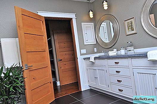
White color in the design of skirting boards and door platbands is a win-win option for any combination of shades. Therefore, if there is any doubt about the right color harmony, you should put a white “canton” around the perimeter of the floor (ie, along the baseboards) - it will smooth out the flaws.
If there is more confidence in choosing the color of floors and doors, the tone of the skirting boards can be combined with one of these parts, provided that the doors and the floor are different. When these 2 elements are painted in the same color, you can choose a contrasting shade for skirting boards.

The same contrasting “attitude” can be chosen between the floor and the door. And here 2 main options are recommended: dark doors and a light floor, light doors and a dark floor. But with any chosen option, it is necessary to adhere to the main rule of design - the set should have no more than 3 basic colors (and for beginner designers it is advisable to stop at all 2). Better to "play" with the intensity of the shades.
Color and other options
But you can not "go in cycles" only on a combination of colors. Do not forget about such a moment as the visual perception of the entire room. After all, it is with the help of color that you can visually either reduce the space or increase it.

So, a dark room will make a small room even smaller, but a light one will help "expand the boundaries." Therefore, the doors here should be like a continuation of the floor.

The same can be said about a large room, only exactly the opposite: the floor should be painted dark and the door should be light (so that the “border” is clearer).
An important role is played by the side of the world, on which the windows of the room go. In the "northern" rooms there is always a lack of lighting. Therefore, it is desirable to select lighter shades in the design of all interior elements (especially floors). That is, it is necessary to increase the reflective surface so that the sun bunnies “play” as often as possible in the room.

As for the "southern" rooms, then, naturally, you need to increase the light-absorbing surface. So, it would be more logical to use darker paint to cover the floor.

By learning to combine visualization and the "play" of light, it will be possible to achieve interesting solutions in the design of any room. And the most daring, perhaps, will swing at the vanguard (which is very fashionable now).
Custom design solutions
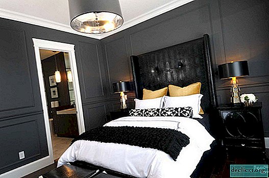
Recently, designers are increasingly trying to experiment, offering non-standard solutions in the design of rooms. And one of these options is to introduce a bright colorful spot into the interior, the role of which is played not by a decorative element on the wall, but by an ordinary door.

Rather, not ordinary, but painted, for example, in red, green or even red. But if such a decision is taken as a basis, it should be remembered that the tone of the door should still “resonate” with some other elements of the interior: something from furniture, or curtains, accessories on the walls. By the way, it is a skirting board painted in the same color as the door that can become the logical conclusion to the whole composition, as if framing the entire interior.
Also, one should not forget that such avant-garde may not fit into the guest room or bedroom (where it is desirable to use more “soft”, pastel colors). But for the kitchen, dining room or children's room, this color scheme may be useful.
For rooms where there are no windows (corridors, anteroom, bathroom), avant-garde solutions, on the contrary, can become kitsch. These rooms are usually small. Therefore, the main goal here is to visually increase the volume. But this is usually achieved by light shades of doors, ceilings and walls. But the floors for some reason try to paint in non-marking colors.

To move a little from the standards "brown floor - white doors", you can paint the door in a more pleasant color - beige. It will soften the "rudeness" of the sexual shade.
Dark gray floors in the hallways can also be called a “boring” classic. Therefore, for the door it is better to take the paint also gray, but several shades lighter, and the baseboards should also be painted into it. This "grayness" just can be "cheered up" by some bright spot on the wall.


And if you still dare to paint the floor in a pale gray color, then for the door the best color scheme would be ivory. For skirting boards, any of these colors will do.
Conclusion
But no matter what options for combining shades in the design of doors, floors and skirting boards are chosen, they should organically "interweave" in the general surroundings with the ceiling and walls.
Doors should be combined with furniture or contrast with it (but be in harmony). The color chosen for skirting boards should “flicker” in other elements of the interior.
When choosing color solutions for one room, one should not forget that other rooms are adjacent to it. With open doors, the transition in the design should be smooth, as if repeating the motive and idea of the interior of the next room. In other words, harmony should not be present in a single room, but in the whole apartment.
Watch the video: 3 Awesome Baseboard Ideas! (May 2024).


-
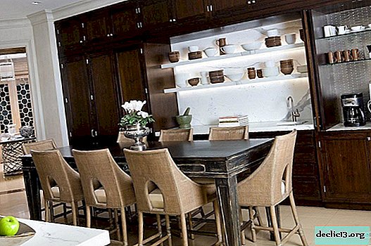
Creative approach to choosing chairs for the kitchen
At first glance, the choice of chairs for the kitchen space is a simple task. As a rule, chairs are picked up almost at the very end, when the surfaces are finished, the main furniture is ordered, the location of household appliances, work areas and storage systems is determined. It remains only to choose chairs in accordance with the design and coloring of the dining table, bar counter or kitchen island. ... -

-

-