Green palette for decorating the hallway
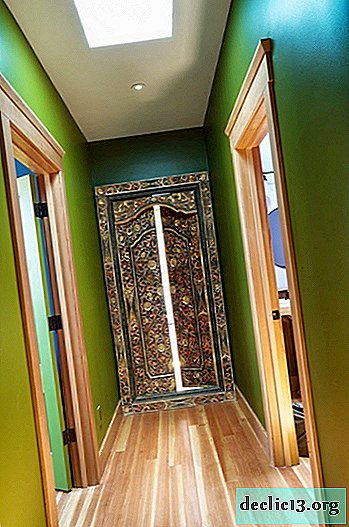
It is proved that the green spectrum for our eyes is more distinguishable than others, we are able to perceive many variations of tones of this color. In green shades we see nature itself - fresh greens, foliage and grass, light meadows and fields, dark backwaters and swamps. It is the natural origin that psychologically comfortable sensation owes, which is inevitably created when looking at one of the shades of green. For modern urban apartments and private houses, the interior in which certain green tones are used is favorable in terms of emotional and psychological relief. Not only in megalopolises, but also in medium-sized cities, the streets and interior of buildings are oversaturated with advertising, colorful, flashy colors and their combinations. The city dweller involuntarily experiences irritation at the end of the working day, often without even realizing it. Coming home, we want to relax, distract from the bustle of the city, calm the running of thoughts and the change of emotions. The interior in green tones can help us with this, especially if shades of green are present in the first room, which meets us at the entrance to the dwelling - in the hallway.
The effect of green in the interior on a person
Green color favorably affects our psyche, it relaxes and soothes, gives a sense of security and stability. The shades of green used in interior design help relieve color stress, which has become a frequent companion of a modern urban dweller.

The palette of green shades is quite versatile and can harmoniously fit into the interior of almost any stylistic direction. The boundaries of our capabilities are expanded by the fact that most shades of green can be combined with many other colors in the interior.

Shades of green that will be appropriate for interior decoration
Some homeowners are afraid of using green in the interior of their homes, because they represent bright green walls or emerald upholstery. But the green color has many different shades, half of which can be a neutral background for decorating the hallway, corridor or any other auxiliary room.

Shades of green that can decorate the interior of your home:
- pistachio (light green with a cool tint);
- olive (green yellow);
- green mustard;
- pea;
- lime color;
- khaki (brownish green);
- light emerald;
- malachite;
- lime;
- mossy green (warm shade of moss color).


The combination of green with other colors in the design of the hallway
Will the green color be used by you to decorate the room, or can it become the basis for painting furniture, or maybe the decorative elements of your utilitarian space will be so colorful that their green color will become focal? In any case, in addition to green, you will need to apply shades from another segment in the color spectrum and how effective the combination of this or that color with green can be judged by the following examples of design projects of various auxiliary rooms.

Green and white
As you know, white is the most universal color, it can be combined with any shade. But in addition to its basic quality, white is able to soften the presence of a different color. If you want to use a bright, saturated version of green, then in a company with a white tone it will look softer, calmer.


Most often, a shade of green is used to decorate the walls in the hallway, but for a truly original design, you can use the green palette for the execution of furniture, for example, storage systems. In combination with snow-white wall decoration, such a furniture ensemble will look noble and expensive.

The combination of one of the shades of green with white creates a simple modern interior. Violate this two-color and give some picturesqueness to the room using wood flowers of any key. Such an interior looks concise and noble.


Shades of green and tree
Green color is associated with nature in our country, similar analogies are inevitable - young foliage and freshly cut grass are forever imprinted in our thoughts in the case of an associative series. And what could be closer to nature than a combination of green with wooden surfaces? It is important to note that in the case of green shades in the interior, you do not have to worry about the use of wood of various species, textures and tonalities within the same room - the atmosphere will be harmonious, the design balanced.

For the country style in the design of the hallway, you can use the following color variations - green shades for the execution of the rack apron, a light beige palette for painting the upper part of the walls and ceiling covering, and dark wooden surfaces for furniture. Nature itself is reflected in this design.

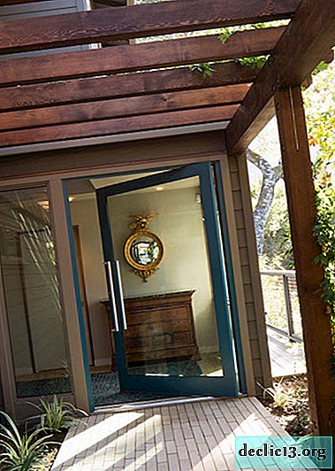
To design a hallway, corridor or any other room in a country house, the use of wooden wall panels for wall decoration is a frequent design technique. Staining such surfaces green together with the use of furniture made of light wood, gives a stunning result in racy color.

Green shades and black
The presence of black in the interior of the hallway can most often be seen in the execution of furniture elements, lighting fixtures or decor. But there are design projects in which black is assigned a more important role, for example, the execution of flooring. Such a dark and deep color of the lower part of the room needs a lighter and even airy painting of the walls and ceiling. In this case, the combination of light green with white will be an ideal option.


Vibrant colors combined with green
For large originals and bold enough homeowners, you can offer a combination of a bright shade of green, for example, the color of lime or lime, with a shade of no less racy brightness. Such combinatorics will immediately demonstrate to anyone entering your home the fact that the interior of this house will not be boring. Bright, colorful shades can not only bring a positive mood to the interior of the room, but also charge the household with a tone for the whole day.

For an eclectic interior with many different colors, you can choose a shade of green for emphasis. It is important only in pursuit of a variety of color palette not to mix in one space too many colors opposite in temperature and tonality. The basis is still better to take white or any other light, neutral color.


