Gray combination rules
Building an interior in gray is one of the most difficult, but interesting tasks. Of course, all other colors also have their own nuances, but gray is too sensitive to the colors that are next to it. In addition, it has an amazing variety of shades. But this color has a certain magical appeal, its neutrality and tranquility can make the room unusually comfortable, hospitable and relaxing.
Gray interiors will suit lovers of grace and respectability.
Gray interiors are sophistication and sophistication of taste


So, before proceeding with the design of the room in gray tones, you need to carefully think through everything, see examples of existing interiors, discuss this issue with specialists and only then begin the implementation of the task. After all, one mistake, one inaccurate step and all - instead of a cozy nest, we get boredom and, possibly, even depression. But not everything is so scary, for decades, designers have accumulated vast experience in working with all colors and their combinations. For example, many experts love working with gray color, it can easily be used to correct mistakes already made in the design, and you can also balance any color combinations. But with every shade of gray and every combination of it, you need to work differently.
To begin with, let's take autumn shades of gray. Why? Because it’s easier to work with them, they are more neutral and less catchy. We are talking about such tones as the color of the clouds before the rain (but by no means for the ceiling), the color of willow branches and the mouse color.
The color of the clouds before the rain

The color of willow twigs

Interior in mouse color

But these shades should not be used as accents or additions, they can only be background. But you can supplement them with a tree in any of its manifestations or colors in wood. The most preferred in design works are light yellow and reddish shades of wood, such as light oak, birch, walnut, beech, acacia, alder.


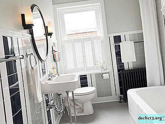
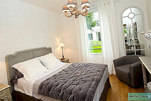
In combination with white
Choosing this combination for the interior is hard to make a mistake, this is the most win-win option. What should be considered here? Gray should be naturally soft, and white from a sweet palette, for example, the color of coffee with milk, caramel, cream and milk white. Such a magnificent frame will give gray color lightness and warmth.
For those who are afraid to make a mistake with the "partner" for the gray color ...
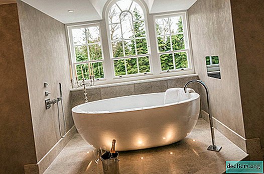
Perfect combination with white

For the bathroom, this is the perfect combination:
Whiteness does not hurt eyes, but there is no gray boredom
With a gray-white combination, you can make incredible color transitions
Add a pattern and more light.
And the atmosphere will become not only light, but also fresh

For a bedroom, such a combination must necessarily have shades from a sweet palette
Otherwise, the dream will not be sweet

The gray and white combination is universally suitable for almost all rooms.


How to distribute the roles of gray and white depends on the natural lighting of the room and its size. That is, if the room is large and well lit by sunlight, and most of the day, then you can also use gray color to decorate walls, furniture, doors, curtains, tiles. Otherwise, gloom and visual reduction of space cannot be avoided. Under other conditions, it is better to make the walls white, for everything else you can choose related shades of white or very light gray. Accessories can be in gray, and coffee or milk shades.

Duo with cyan (blue) and turquoise
The gray-blue interiors are cool but refreshing. Most often they are found in vintage style, although using in other styles is not a mistake. But for a vintage atmosphere, only a certain shade of gray is suitable - light pearl gray with notes of bluish or lilac shades, this shade is called antique gray. In this case, the blue color can be presented in two versions - soft and a little brighter. Such an interior will be refined and sophisticated.
The combination of gray and blue will give a sense of vintage, as well as sophistication and sophistication.

Also, this union of colors is good for classic styles. But here you need to take their pastel shades. In this case, the construction of the interior will be easier. Proceeding from this, it is possible to give any style, even the most modern, to the elegance of vintage or the elegance of a classic while not encroaching on the basis of the style.


If you take a combination of saturated tones of gray and blue (blue or turquoise), then the interior will turn out to be cold, austere, but calm and, one might say, general. Common in the sense that neither male nor female will prevail in such an interior. Well, this combination is suitable for living rooms and, possibly, for the spouses bedroom, taking into account the fact that both will be comfortable in such a cold atmosphere. You can, of course, take this alliance for the dining room or kitchen, but not in large quantities.


To ensure that the situation is not so harsh, you can add a pattern to the walls or furniture. Thus, it turns out that the ornament or pattern with its softness will balance the hardness of blue and gray, giving the interior harmony.
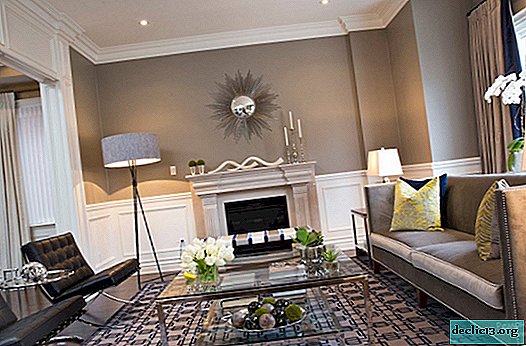
Gray color and its yellow "neighbor"
This is a pretty controversial but awesome combination. It is controversial because the colors are in obvious conflict. But! If you correctly place accents and distribute roles, then the yellow color will “burn” on a gray background, like the sun in the sky (on a grayish sky). What is meant by emphasis and distribution of roles? To create the effect of the sun, it is necessary that the yellow color be in a small amount, it should be much less than gray. Otherwise, the effect of "glow" will disappear.
Choosing a gray-yellow combination, you let the bright sun into your interior

Gray in this combination must necessarily be dominant - walls, floor, ceiling. But not in one solid color, it is better to use several close shades of gray so that the interior is not boring and static (motionless). Furniture in this setting may also be a gray shade, but different from the background, either white, black or wood.

Such a room becomes joyful, despite the gray background. It turns out such an atmosphere as during the summer mushroom rain, when in the sky you can see at the same time gray clouds and bright sun.

This combination can be used in absolutely any room - although it is better to choose other colors for the nursery - but in the kitchen this duet takes a completely different position. It will be too technical environment. The fact is that in the kitchen these colors will be perceived differently: gray as metal, and yellow as a signal. This is due to the fact that the kitchen has a lot of household appliances, cold parts, closed facades and so on. In general, if you still want to use a gray-yellow combination for the kitchen, then in the event that it is a high-tech style. And to create a more comfortable and homely atmosphere, it is better to replace the yellow color with a bed palette or wood color.
Duet with green
This combination creates a warm and comfortable atmosphere. But not only. If the room is small, then the gray walls and ceiling visually stretch the room, making it more spacious. And green accents reinforce this feeling and, without focusing on this particular attention.

In general, this combination is not so common in interiors (and in clothes too), but if such a duet is chosen, it will bring calm and tranquility to the room.
The gray color in the interior does not attract attention, it emphasizes those colors that are "adjacent" to it, thereby making them full. The gray-green combination looks soft and unobtrusive, such an interior will never get bored, regardless of whether bright or muted shades of green and gray are chosen.
Light and unobtrusive interior in gray-green design, which simply can not get bored

The union of gray and brown
The attitude to such a combination is ambiguous. Someone is sure that you cannot combine these two neutral colors, calling them a very capricious pair, others believe that they get along well in one room and it looks interesting. Of course, everyone has the right to their opinion, but there are many examples of design, where gray and brown colors create a wonderful harmonious and balanced pair. You can choose the principle of contrast: gray to take dark and cold, and brown - warm and light. You can also play with the background and content, that is, for a gray background, it is better to choose a light brown, even golden furniture. It is worth remembering that the furniture should not be heavy, massive, it is better to choose something lighter, for example, from rattan. The gray color will look more noble if the brown furniture has an elegant finish or its shapes are slightly unusual. Among other things, for greater harmony, white color can be added to this union, although it is also neutral, but its versatility and practicality will make the interior easier and more interesting.
Medium gray with brown
This creates a cozy and soothing atmosphere in the bedroom.

Any shade of brown is suitable for gray.
Even better if several are used at once.

In alliance with brown, gray can be expressed in different ways ...
At the same time as a leading background and as a neutral amplifier of brown


By the way, there are some shades of gray that are combined perfectly with brown (as well as with all “earthy” ones). This is a palette of mid-gray tones, namely: aluminum, bog oak, gray flannel, tin and ivory. These tones are masculine materials such as slate and granite and have notes of beige and gray-brown tones. That is why, in combination with brown, they give a kindred palette that looks great in the interior. The sophistication, chic and soothing effect of this combination is well suited for the bedroom or living room.
Gray red combinations
The combination of gray and red has become very popular in the modern world. Most often it is used in high-tech, art deco and neo-baroque styles. It is stylish, fashionable and luxurious.

And adding black, we get a modern glamorous style. But red and black will be only in the role of accents - although they will attract all the attention - but for emphasis and enhancement of the effect, the background should be gray.

Red flashes on a gray background will look juicy and unusual in the interior of any room. For example, such a union for kitchen sets is good. And for those who want to make their kitchen saturated, but not too bright, this design is perfect: gray and red accents.
For a gray-red kitchen to be bright, but not flashy, gray should be dominant, and red should be used as an accent

In general, for this tandem it is more successful to use gray as the dominant, and red as the complement. The fact is that this is still a bit pulsating and difficult to understand combination. Therefore, this role distribution softens the sharpness a bit. White color is also often added to this union, which, as you know, is very versatile and is an excellent “neutralizer”; in addition to white, cream color can be added. All this helps not only to soften the general appearance, but also to prevent the room from visually decreasing, due to the presence of red color.
The correct distribution of roles and the addition of white color will create an excellent gray-red interior

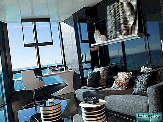
Gray and black
This is a great couple, successful from all sides. Since gray is an intermediate color between white and black, it blends perfectly with any of them. In such an interior there will be no frills, catchiness and pretentiousness. Only laconicism, easy severity and grace. With the help of black and gray combinations, you can perfectly emphasize the shape, as well as remove the excess aggressiveness, if there are still other bright colors.


Gray interiors, both on their own and in combination with other colors, are a great solution for people who want to emphasize their prosperity. It has long been proven that people with low incomes are trying to make their interiors bright and flashy. But more successful ones prefer black, white and gray. Such designs look moderate, respectable and sophisticated.
Watch the video: How to Pair Brown & Gray - Color Combinations for Tans & Greys in Menswear (January 2025).

-
Planting radishes in a polycarbonate greenhouse: when you can plant, how to carry out the procedure and the best varieties
Radish is the earliest vegetable that gardeners begin to grow. Recently, polycarbonate greenhouses are gaining more and more popularity due to their ease of use and the creation of comfort for plants. The greenhouse allows you to start planting much earlier and get the best harvests. This article will discuss the features of planting a vegetable planting in closed ground in different regions of the country, which varieties of the variety are suitable for this, and also what problems and difficulties may arise. ... -

-

-