Turquoise color: combine with the soul
Turquoise is often called blue or green, this is because it is a thin line between these two colors. Although this color can be called independent, it has its own shades, there is a dark and light turquoise and "color of the sea wave", using them correctly, you can achieve amazing results. Turquoise has the unique ability to fill the room with romantic grace, as if it had jewelry from turquoise itself. In such an interior you feel as if surrounded by endless sea open spaces or a thicket of wild forests.


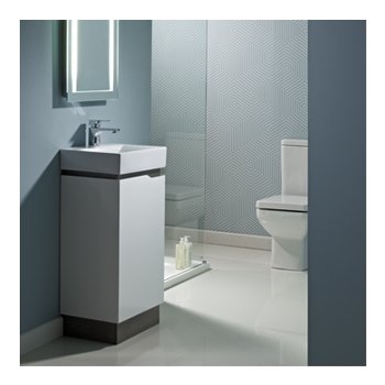
If you are not sure that the turquoise color is a great idea for the interior, then first try to make a bath in this color.
If you are not sure about the turquoise color, try first to make a bath in this color ...

Using the example of a turquoise bathroom, try to figure out if this color suits you or not.

In such an atmosphere you feel like on the seabed, the turquoise color envelops with its originality, softness and grace.
Intense Turquoise
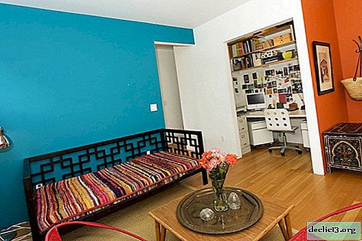
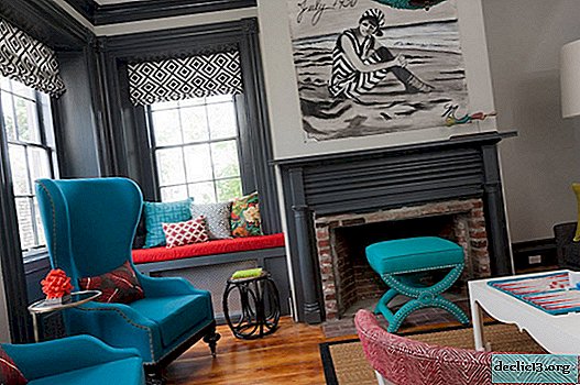
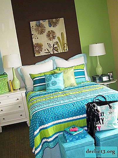
And if you are not afraid to experiment, and bright colors are acceptable for your life, then feel free to use intense turquoise in other rooms. You can simply make a few accents in this color.
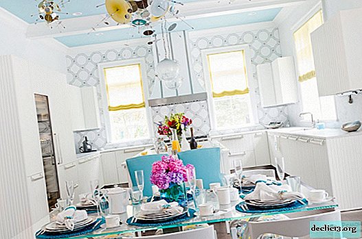
Simple turquoise elements in the kitchen
Such accents diversify the usual rhythm of life.
One or two accents of turquoise and the room will become more fun
If you add turquoise accents to the neutral interior ...
That room will give a pleasant and fun cool variety
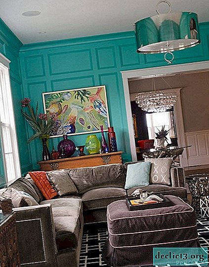
Do not be afraid of turquoise walls
They will reflect your personality and cheerful character.


But do not forget that turquoise is a cold color, respectively, a lot of turquoise - a lot of cold. Therefore, if you are ready for this, then feel free to proceed to such a design of the room. And if you use a picture, for example, on wallpaper, furniture or a picture with a picture of a flower on a turquoise background, then the effect will be the opposite, that is, softer and not so cold.


By the way, it is important to remember that combining bright turquoise is better with calmer shades, otherwise the whole effect of turquoise will disappear, and the room will be too colorful.
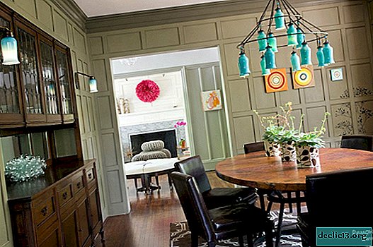
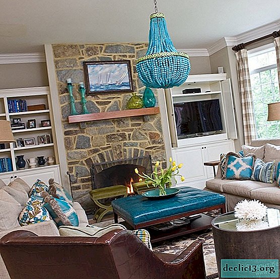
To the turquoise chandelier is not lost
Great olive background
If you want to make small accents in turquoise color
Pick a neutral background that won't drown turquoise
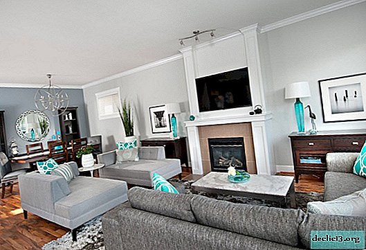
Larger turquoise accents
The background will suit them and darker
The color of natural stone successfully emphasizes turquoise
Fans of contrasts will suit the horizontal division of the interior
Top - turquoise, bottom - neutral colors


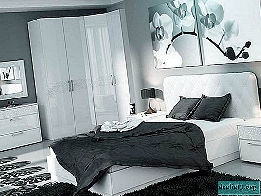
Turquoise and beige
Pastel shades are ideal for turquoise motifs; they add airiness and serenity to its light coolness. Such interiors are suitable for dreamy people, with a calm character. In such interiors, it is advised to use a turquoise color in moderation, for example, for one wall and several accentuating objects. A beige color to apply for furniture, some sections of the walls and other details. The point distribution of roles is used here, it sets the desired mood for the room, since chaotic mixing of colors is more appropriate if they are close in tone. But with a combination of bright and calm colors, it is better to move them away from each other, otherwise one of them will be lost.
When combining turquoise and pastel colors, do not mix them, a point distribution will be more appropriate

Turquoise and tree
Since the turquoise color represents nature, you can supplement it with a tree both in color and material. Such an interior will be the most comfortable and homely, you will want to spend as much time as possible here. The atmosphere of the dining room, designed in this way, will be conducive to sincere and intimate conversations.

The color of wood or thatch in combination with turquoise can make the interior more energetic, and visually increase the size of the room, it all depends on the presentation and design. In addition, the tree in this union will soften the coolness of turquoise color, and the interior will become warmer.


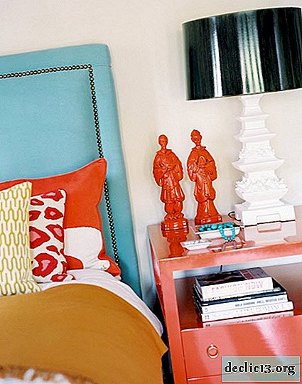
Blurred turquoise
But, despite all the advantages of a turquoise color, it can rarely be found as an interior decoration. What is the reason for this injustice to this color is not clear. After all, if someone does not like its excessive brightness, then you should pay attention that the turquoise color, like many others, has more muted shades, for example, blurred turquoise. This shade is widely used in Western interiors due to the fact that it is not so cold and not too active. This color is calm, it helps to reduce the intensity of the setting sun.

Blurred turquoise is well suited for a children's room, bedroom and even a study. With regard to the children's room, the softness of the blurry turquoise is suitable for bright accents, or the combination with another more saturated cabinet is also good for the blurred turquoise color, it does not cause drowsiness, but it does not distract from work, for example, red, orange, blue, green. Such combinations will make the room fun, but not pressure on the psyche.
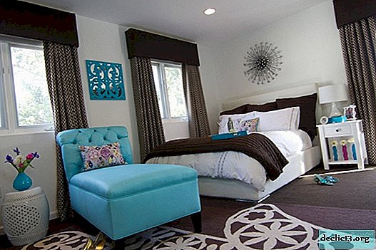
As for the bedroom, here, as always, preference is given to a calm range of colors, as it is most suitable for good sleep and relaxation. Therefore, the use of blurry turquoise is the best fit here in combination with bed tones.
Lovers of softness and lightness for the bedroom choose the color "blurry turquoise"
It gives a good mood, but also does not put pressure on the psyche
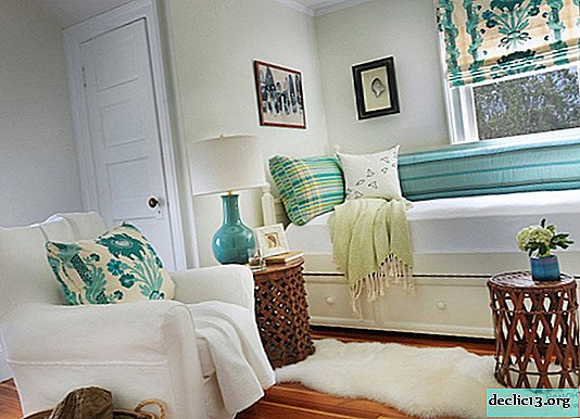
The color "blurred turquoise" is ideal for a bedroom
There will be freshness and peace.
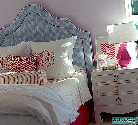
Blurred turquoise in the bedroom will contribute to a good rest
If you use the turquoise color in the bedroom ...
It’s better to take a softer shade


A blurred turquoise color is also good for a home office; it does not cause drowsiness, but also does not distract from work.
To prevent a drowsy mood in your office or color not distract, choose a blurry turquoise.


In working with any color, there are many nuances and opportunities to beat it correctly. Use as the main one or in the form of an accent, rich or soft, combine with bright colors or neutral - it all depends on the desired result and the value that is given to the room. The main thing is to do everything with the soul.
Watch the video: The UNDERTALE Soul Colors You Never Knew Existed! Underale Theory. UNDERLAB (May 2024).

-
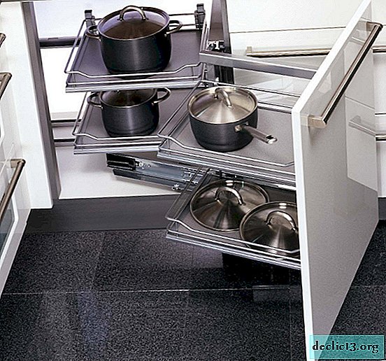
The functionality and advantages of the magic corner for the kitchen, the rules of choice
The main problem for owners of small apartments is the lack of space, especially in the kitchen. In this room, difficulties constantly arise when placing dishes, utensils, household appliances and modern electrical appliances. To remedy the situation, making the hostess's life more comfortable, a magic corner for the kitchen was developed, which makes it possible to effectively use one of the cabinets. ... -

-
-